





Carousel
Slides that scroll and snap, with arrows and dots.
Product screenshots
One screenshot with part of the next one showing. Set arrows when users may not know they can swipe, such as for screenshots on desktop. The arrows show on hover.
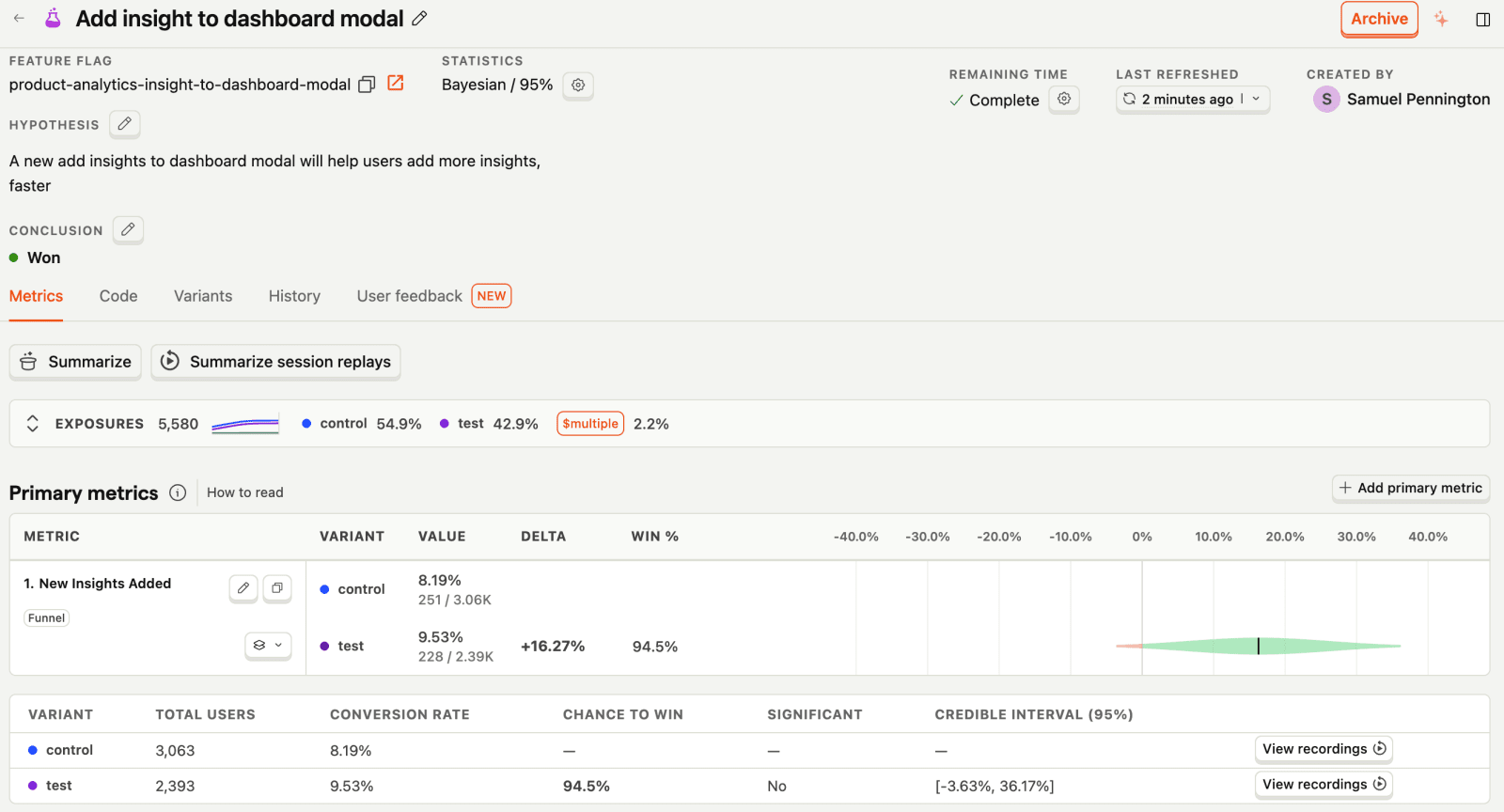
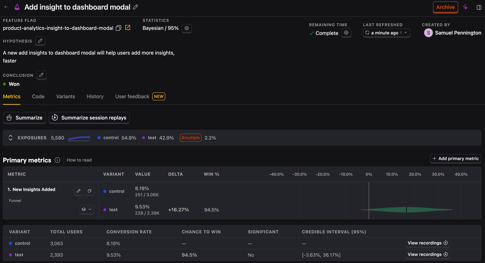

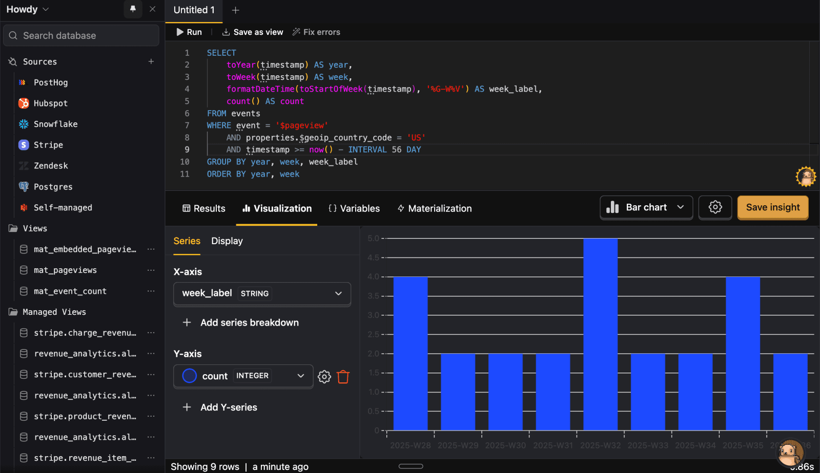
Slide 1 of 2
Several slides per view
Wider containers show up to three cards.
Slide 1 of 6
Optional automatic slides
Campus photos advance every five seconds. The active dot fills while the next slide waits. Use the pause button to stop automatic slides.


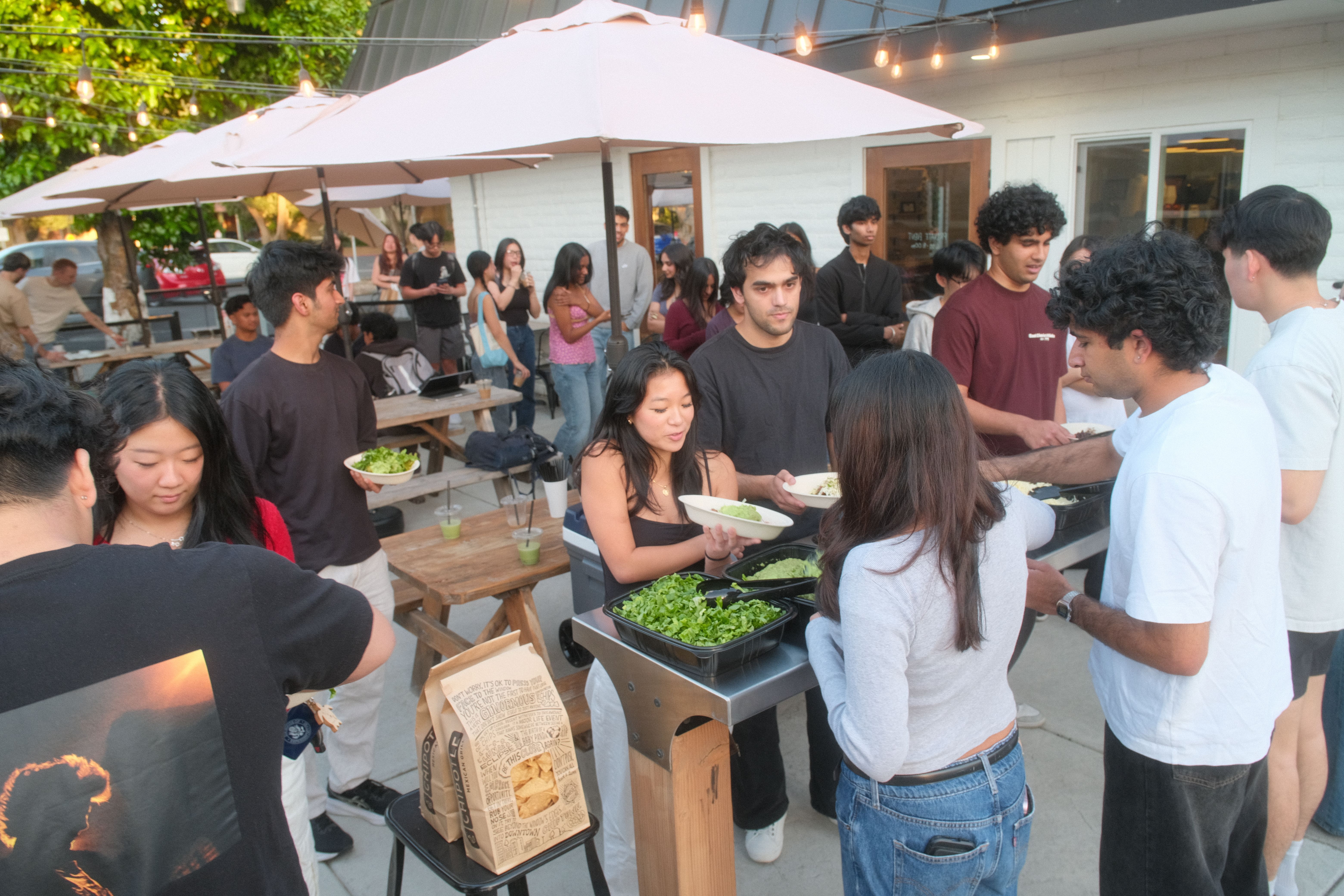
Slide 1 of 3
Usage
These are defaults, not laws. Break one when you have a good reason, or when it makes the design more cohesive or more interesting.
- Use a carousel to browse a set of similar items. Do not put content that every user must see after the first slide.
- Use slides with the same aspect ratio, so the row height stays stable.
- Use
autoplayrarely. It stops when the user focuses or moves the carousel, and it is off for users who prefer reduced motion.
API
Carousel is a site component. Each child becomes one slide. It uses native CSS scroll-snap without a slider dependency.
Carousel
| Prop | Type | Default | Description |
|---|---|---|---|
| label | string | – | Names the carousel region. |
| children | ReactNode | – | One slide per child. Use stable keys when data changes. |
| slidesPerView | 1 | 2 | 3 | 4 | 1 | Sets the maximum slide count in a wide container. |
| peek | boolean | false | Shows 10% of the next slide, from 32px to 80px, with a soft edge fade. |
| autoplay | number | 0 | Sets the delay in milliseconds. Zero disables it. The minimum delay is 1000ms. |
| dots | boolean | true | Shows buttons for distinct scroll stops. |
| arrows | boolean | false | Shows previous and next buttons on the left and right of the slides. They appear on hover and keyboard focus, and always on touch screens. |
| onActiveIndexChange | (index: number) => void | – | Receives the zero-based index at the active scroll stop. |
| className / slideClassName | string | – | Adds classes to the region or each slide. |