





FeatureTabs
Tabs that play through features with a progress bar.
Self-driving hero
Use hero for the first feature tour on a page. This example has four feature tabs.
Notable things happening in your product
A signal is a single observation about your product.
Exceptions and stack traces grouped into issues
Dead clicks, quick backs, long stalls
Tickets and conversations from your users
Zendesk, Linear, GitHub issues
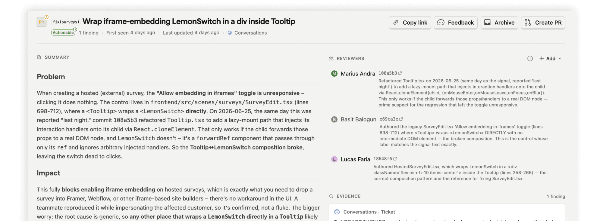
Desktop features
Use minimal (the default) for later tours on a page, or for a tour inside a section.
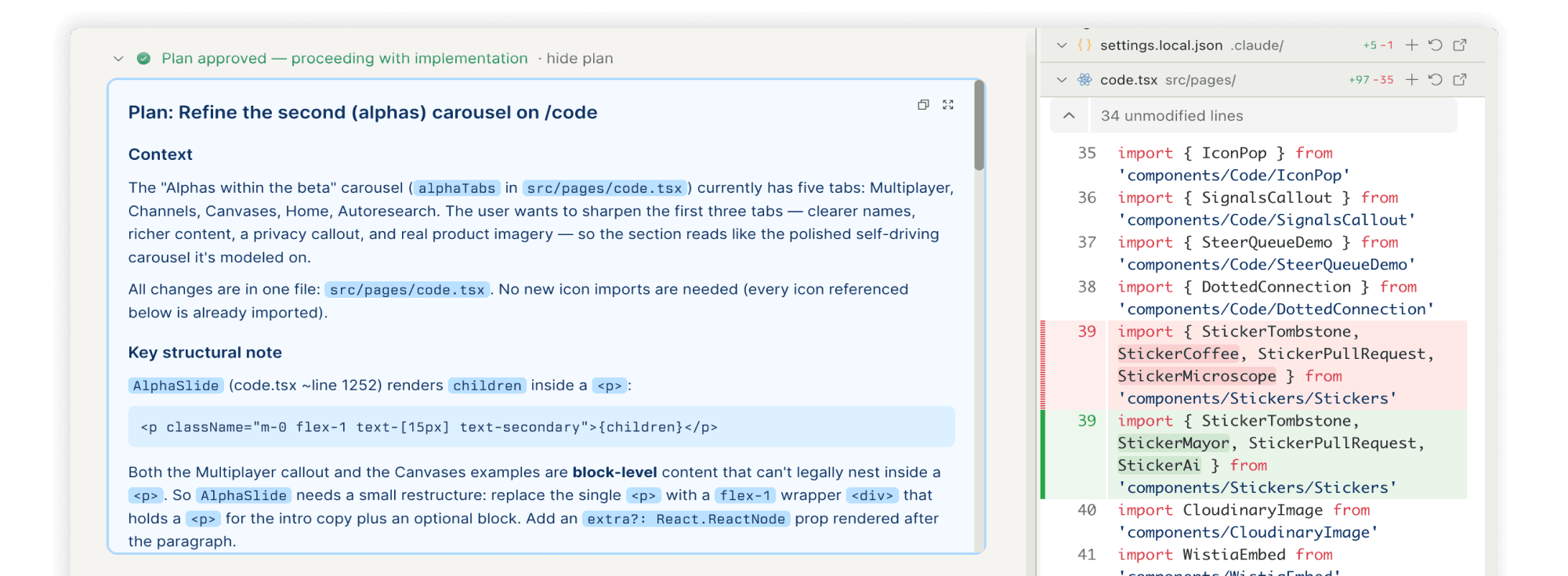
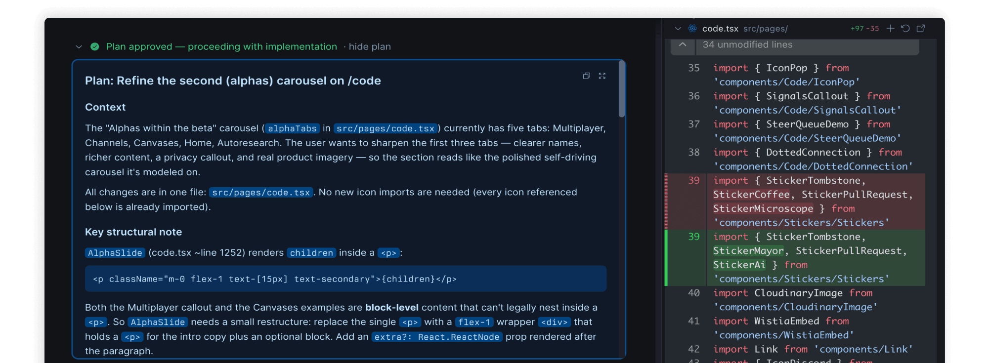
Agree on the plan before any code
If dangerously skipping permissions isn't your thing, coding tasks can start in Plan mode. The agent explores your data, asks clarifying questions, then writes an implementation plan for you to approve.
Switch anytime, even mid-task
Choose your weapon
Still effortless for you
Usage
These are defaults, not laws. Break one when you have a good reason, or when it makes the design more cohesive or more interesting.
- Use FeatureTabs on marketing pages to step through a few product features. To switch views inside an app, use Tabs.
- Give each tab a unique value. Autoplay pauses on hover, off screen, and for users who prefer reduced motion.
API
FeatureTabs is a copy of TabbedCarousel. It keeps Radix Tabs, the existing tooltip, and the original API. Named and default imports are available.
FeatureTabs
| Prop | Type | Default | Description |
|---|---|---|---|
| tabs | FeatureTabsTab[] | – | The feature tabs. Supply at least one tab with a unique value. |
| slideDuration | number | 5000 | Sets the progress animation duration in milliseconds. |
| autoplayStartDelay | number | 0 | Pauses the first slide until this delay ends after mount. |
| className | string | – | Adds classes to the outer container. |
| slideClassName | string | – | Adds classes to the colored slide frame. |
| showActiveBg | boolean | true | Paints the active color in minimal mode. Hero always paints it. |
| appearance | 'minimal' | 'hero' | 'minimal' | Selects quiet tabs or bordered hero tabs with color halos. |
FeatureTabsTab
| Prop | Type | Default | Description |
|---|---|---|---|
| value | string | – | Sets the unique tab value. |
| label | ReactNode | – | Sets the visible tab label. |
| icon | ReactNode | – | Adds a tab icon. Any icon makes all triggers stack their icon and label. |
| content | ReactNode | – | Sets the image, video, or content panel. |
| color | string | – | Sets the active background classes. |
| activeText | string | – | Sets the active text classes. |
| progressBar | string | – | Sets the progress bar classes. |
| triggerClassName | string | – | Adds classes to this tab trigger. |